
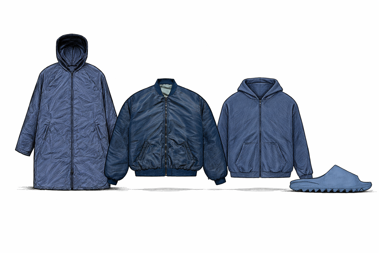
The latest drop from YEEZY does not announce itself loudly. It doesn’t need to. Under the banner of “YEEZY BLUE,” the collection leans into a single color story and a tightly controlled set of silhouettes — outerwear, a bomber, a zip hoodie, and the now-familiar molded slide. On first pass, it reads as minimal. On second pass, it becomes clear that the restraint is the point.
That quietness is worth noting in context. This is not a brand operating at full cultural momentum. YEEZY exists in a complicated space right now — the name still carries weight, but the figure behind it carries controversy that has cost him partnerships, platforms, and public goodwill. A drop this restrained, this deliberately low-profile, reads less like a stylistic choice in isolation and more like a calculated re-entry. The brand is testing whether the work can speak without the noise.
What’s being presented here is less a seasonal collection and more a continuation of a long-running design thesis: reduction as identity. The pieces strip away excess — no visible branding, no graphic interruptions, no narrative cues beyond form and color. The long coat (RC-04) extends the body into a uniform silhouette; the bomber (BB-01) compresses it into something more utilitarian. The hoodie and slide follow the same logic. Everything is familiar, but intentionally flattened.
The choice of blue matters. Yeezy has historically operated in tonal worlds — earth, sand, black, grey — colors that recede rather than declare. Blue introduces a shift, but not a dramatic one. It stays within the language of neutrality while offering just enough variation to signal evolution. This is not a color story built for visibility. It’s built for continuity, for wearability, for an aesthetic consistency that prioritizes system over statement.
That system is where the tension lives. Yeezy’s design language has always existed at the intersection of accessibility and control. The silhouettes are simple enough to be widely adopted, but the distribution model, pricing, and cultural positioning complicate that accessibility considerably. That complication runs deeper than price point. The brand is currently navigating a cultural landscape shaped by its founder’s public fall — and the stripped-down aesthetic may be doing double work. Removing visible branding isn’t just a design philosophy here. It’s also a way of letting the garment exist without forcing the wearer into a statement about the man who made it. The uniform becomes an opt-out as much as an opt-in.
What looks like uniform can quickly become coded — who wears it, how it’s styled, where it appears. In that sense, the collection isn’t just about clothing. It’s about how identity gets constructed through repetition.
There is also the question of progression. For longtime observers, this drop will feel like extension rather than disruption. The forms are refined but not reimagined. The palette is adjusted but not expanded. That surfaces a familiar critique: at what point does consistency become stagnation? Yeezy’s answer has historically been that evolution happens slowly, almost imperceptibly — the brand less interested in seasonal reinvention than in long-term visual coherence.
What This Reveals
“YEEZY BLUE” doesn’t attempt to redefine the brand. It attempts to reintroduce it — quietly, on its own terms, without demanding that the audience resolve anything first. The collection operates as a controlled environment: limited variables, precise execution, a continued belief that simplicity repeated enough times becomes its own form of distinction. But simplicity is also cover. In this moment, reduction isn’t just an aesthetic. It’s a strategy. The question isn’t whether the pieces work individually. It’s whether a brand this entangled in its founder’s reputation can separate the two — and whether this collection is the beginning of that attempt, or proof that the attempt was always the point.